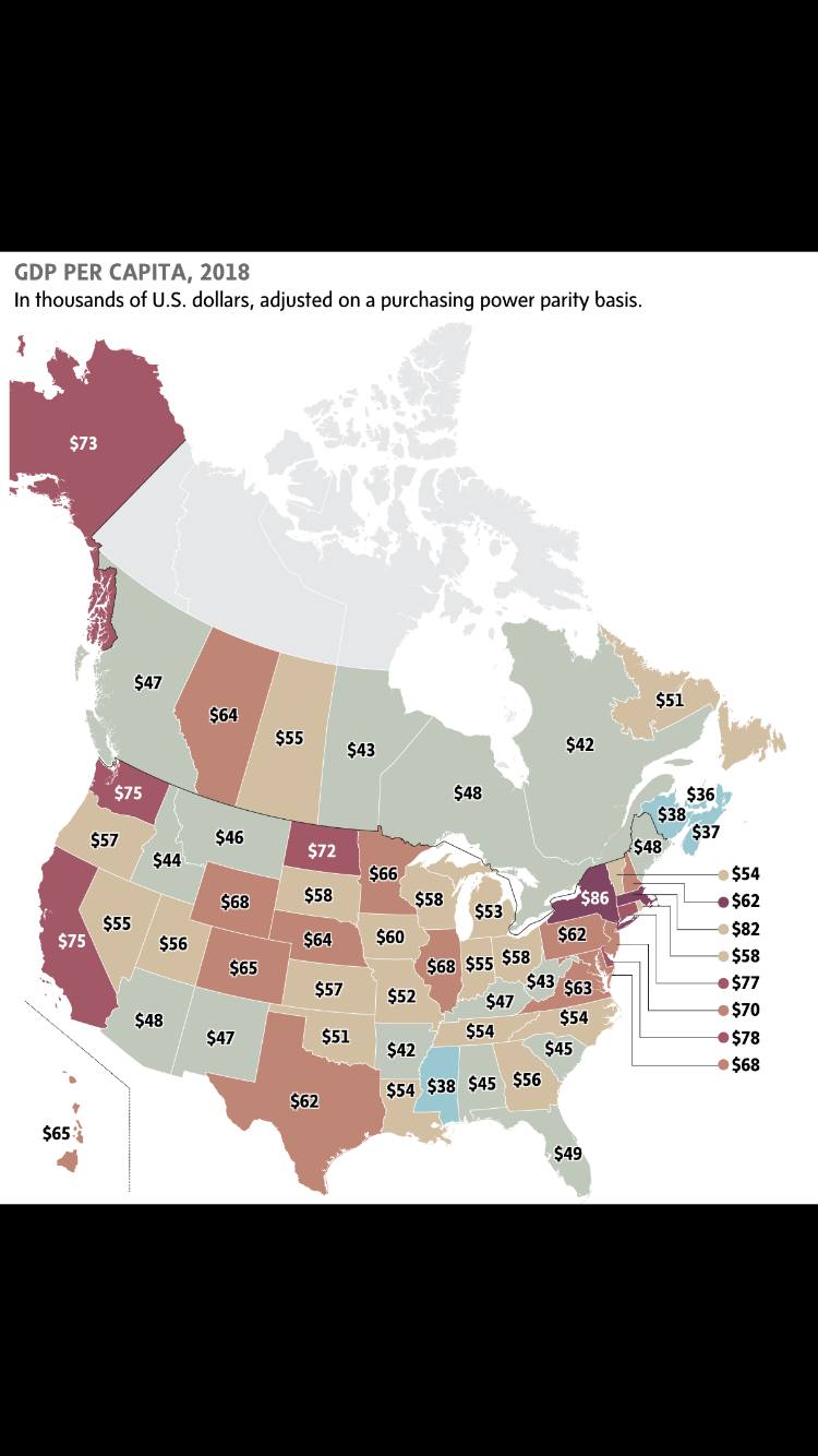
From The article: “As the map makes clear, despite the oil sector’s woes, Alberta’s productivity still vastly outstrips that of other parts of the country. It produces nearly 70 per cent more GDP per person than do the Maritime provinces, and roughly a third more than Ontario.“
Announcement
Collapse
No announcement yet.
Globe and Mail GDP per Province and State
Collapse
Logging in...
Welcome to Agriville! You need to login to post messages in the Agriville chat forums. Please login below.
X
-
Tags: None
-
Alberta must be most productive but if you google Canada’s Richest Province it is Ontario. Oil and resources in general are super economic drivers, we all agree but just think what revenue Alberta could generate if the province were situated at a coast or could move their production to market.
Comment
-
I see Chuck likes the map.
Big surprise. If Chuck looked at a yield map, instead of figuring out how to improve the low yield areas to perform as well as the best areas, he would figure out how to punish the most productive soil to drag it down to the same level as the worst soil.
If the eroded knoll yields 10 BPA, and the old farmstead is 150 BPA, chuck will not be satisfied until he has equalized every acre at 10 BPA, because that is fair and equitable.
Comment
-
Originally posted by AlbertaFarmer5 View PostI see Chuck likes the map.
Big surprise. If Chuck looked at a yield map, instead of figuring out how to improve the low yield areas to perform as well as the best areas, he would figure out how to punish the most productive soil to drag it down to the same level as the worst soil.
If the eroded knoll yields 10 BPA, and the old farmstead is 150 BPA, chuck will not be satisfied until he has equalized every acre at 10 BPA, because that is fair and equitable.
Have you figured out the difference between soot and carbon yet?
The map is interesting in that it shows the per capita size of each province and states economy.
But let’s continue to tell the rest of Canada how bad it is in Alberta!
Comment
-
Guest
-
Originally posted by chuckChuck View PostYou seem bitter! It must bother you that you have such a small share of Alberta’s GDP?
Have you figured out the difference between soot and carbon yet?
The map is interesting in that it shows the per capita size of each province and states economy.
But let’s continue to tell the rest of Canada how bad it is in Alberta!
Why compare everyone to the lowest common denominator, and try to drag any overachievers down to that level, why not aspire to motivate everyone, and every region to be the best they are capable of?
And what does this thread possibly have to with the difference between elemental carbon, and the CO2 molecule? I seem to have missed the segue?
Comment
-
Originally posted by jazz View PostAnd the reason is....american investment and capital. Shows you what this place would look like if we let Trump run it.
Comment
-
Interesting map, the west and east coasts of the USA are doing the best, no oil in any of them and they are Blue Democratic states to boot.
Why are the Red Republican states who don't have oil sucking the hind tit.
Where's that entrepreneurial spirit the Righties like to make claim to?
Comment
-
Originally posted by foragefarmer View PostInteresting map, the west and east coasts of the USA are doing the best, no oil in any of them and they are Blue Democratic states to boot.
Whos in ND? Right, nobody but us oil rigs.
Comment
- Reply to this Thread
- Return to Topic List
Comment